Refining a Legacy: Brand Evolution for a Premium Property Developer
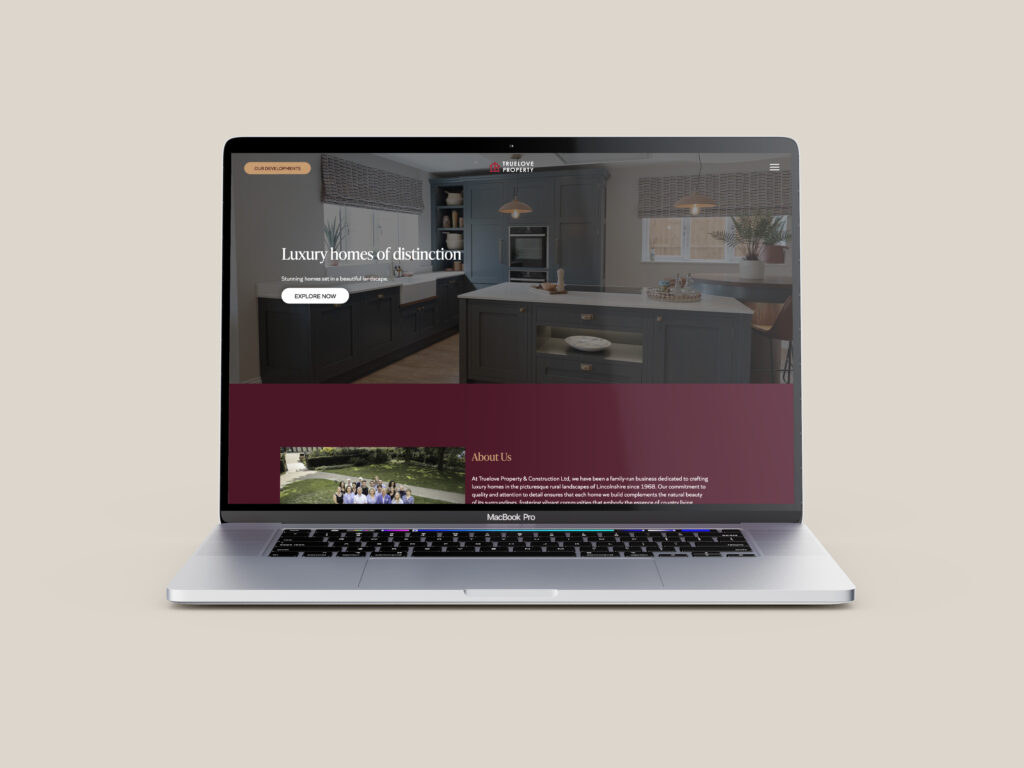
Truelove Property, known for their high-quality new build developments, approached oodle with a brief to refresh their brand identity without losing the heritage and recognition they’ve built over time. The aim wasn’t to reinvent, but to refine – elevating the visual brand to reflect the premium standard of their properties while maintaining continuity and trust.
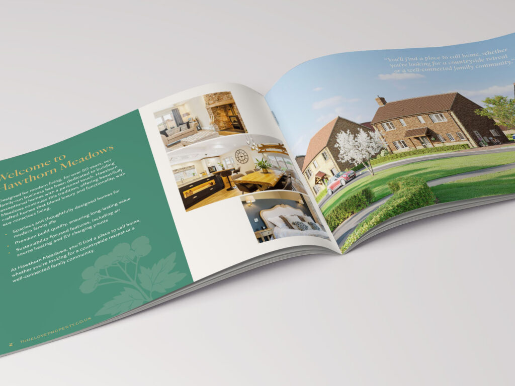
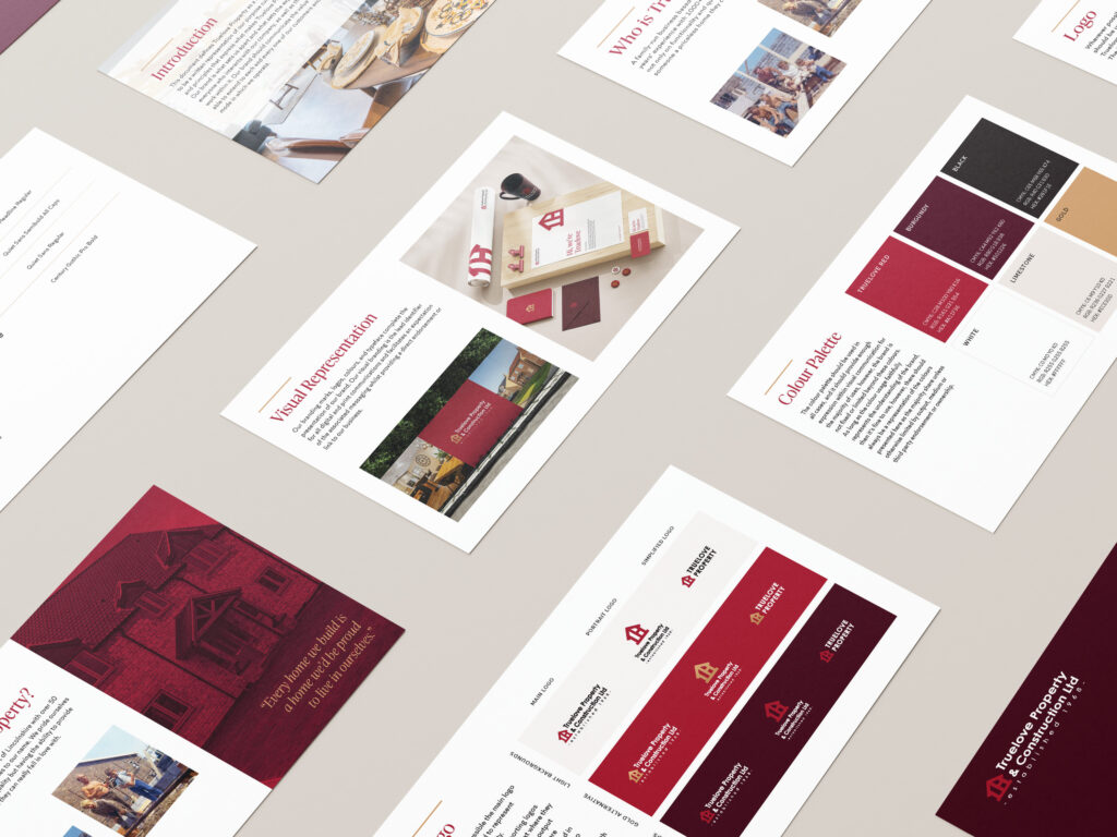
Working in collaboration with our partners at Knapton Wright, we focused on evolving Truelove’s brand visuals. This included developing a refined heritage colour palette, with warmer, more luxurious tones to compliment the existing primary red. The result is a more elegant aesthetic that retains brand familiarity, but better reflects the premium quality and attention to detail that define their developments.
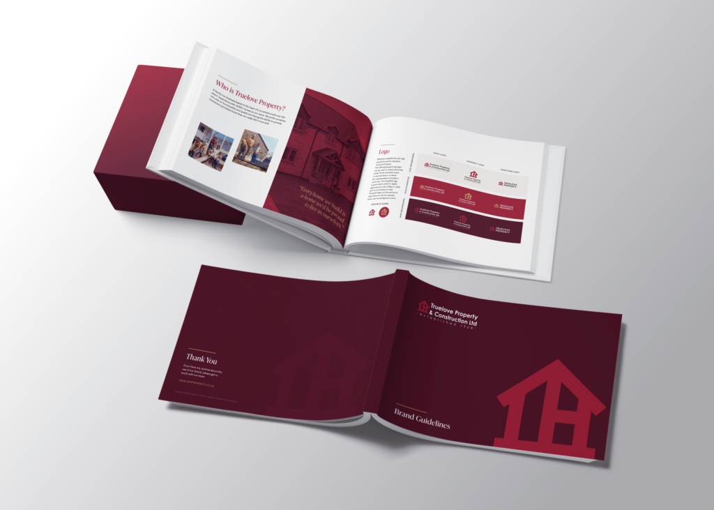
We also introduced more consistent typography across the brand, opting for typefaces that bring clarity and sophistication. These updated elements were brought together in comprehensive brand guidelines, which provide a consistent framework for internal and external communications. The guidelines also included tone of voice direction, shaped by Knapton Wright, to ensure that Truelove’s personality came through in every interaction.
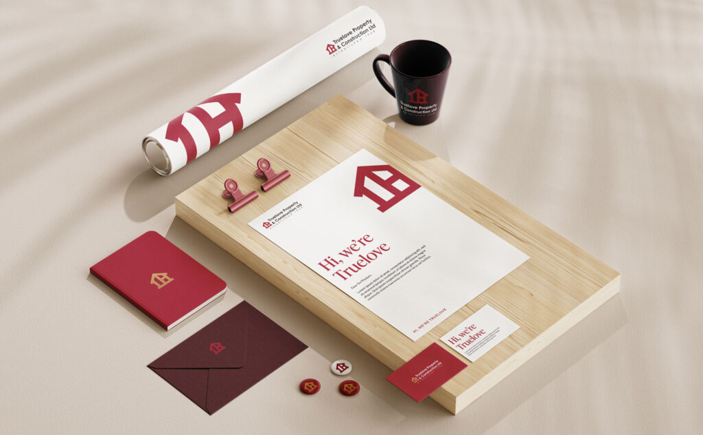
The original logo remained unchanged, a deliberate decision to protect the equity already built in the brand. Our role was to bring visual alignment across all touchpoints, helping Truelove Property present themselves with consistency, confidence and clarity.
This project is a great example of how thoughtful branding doesn’t always mean starting from scratch. Sometimes, the strongest solution is evolution over revolution.