Designing Consistency and Creativity Across the Systematic Brand
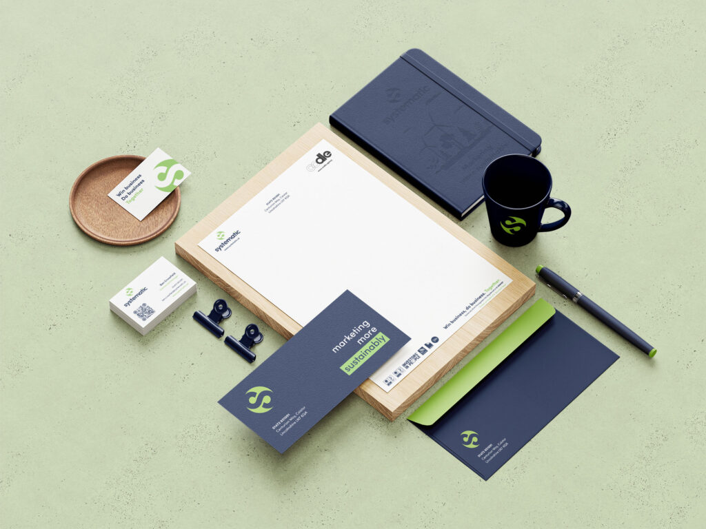
Being part of the Systematic family means we get to flex our creative muscles across a wide range of marketing outputs. From Brand Identity to Motion Graphics, Digital Design to Animation, Graphic and Exhibition Design, our creative team supports Systematic with projects that deliver serious results, without losing the spark that makes oodle’s creativity stand out.
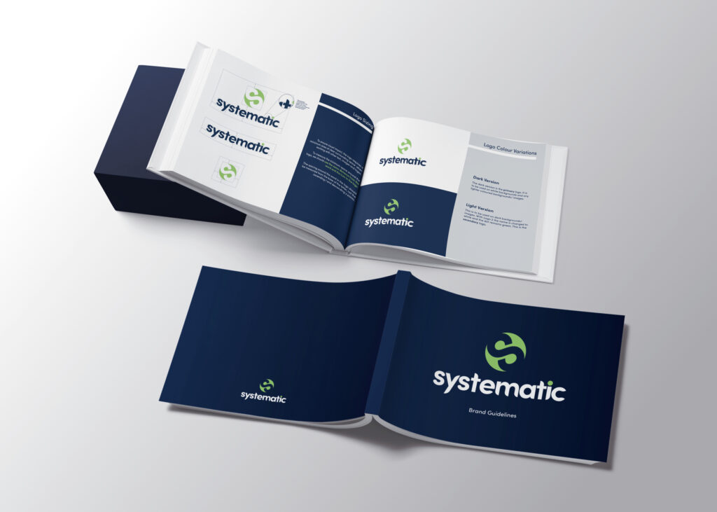
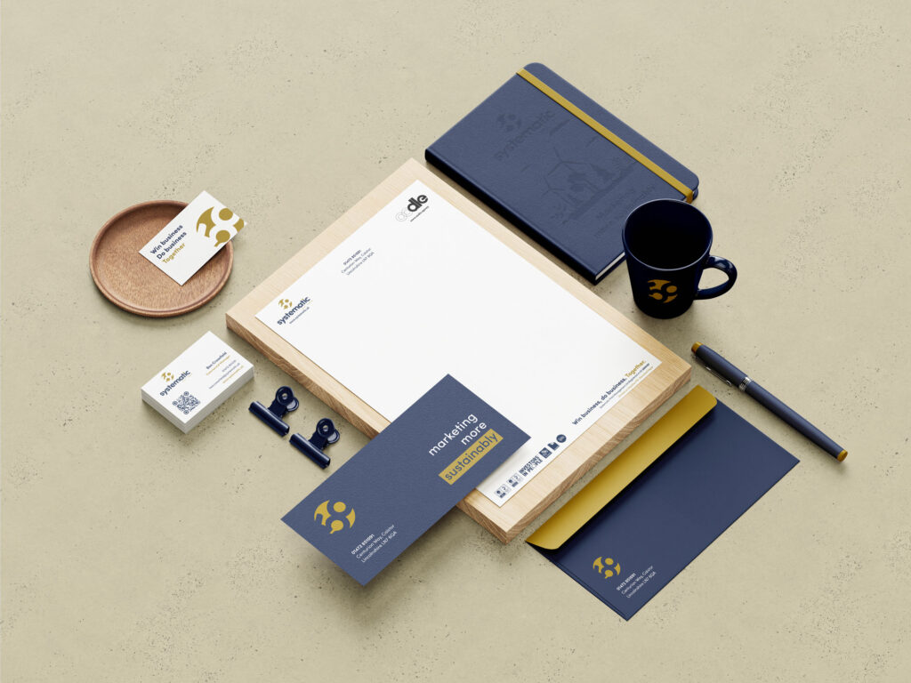
One of our key contributions was the creation of comprehensive brand guidelines. These were designed to ensure consistency across all branded assets produced by the Systematic team. The guidelines covered logo usage, primary and secondary marks, icon placement, colour palettes including a complementary secondary set, and font choices for both digital and print communications.
We’ve also brought Systematic’s messages to life through a variety of explainer videos and animations. These include product explainers, campaign animations, social media content, festive updates, and award celebration graphics. We’ve even cut down long-form videos for social use, giving them new purpose and broader reach.
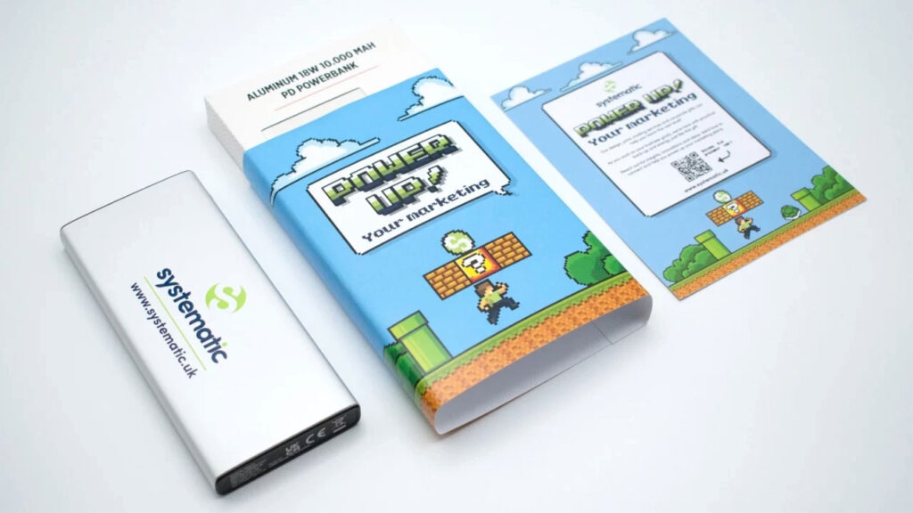
When it comes to campaigns, we’ve helped develop big ideas from scratch. Our team crafted concepts for direct mail, designed packaging, created bespoke illustrations, and even explored AI-generated imagery to support standout marketing content.
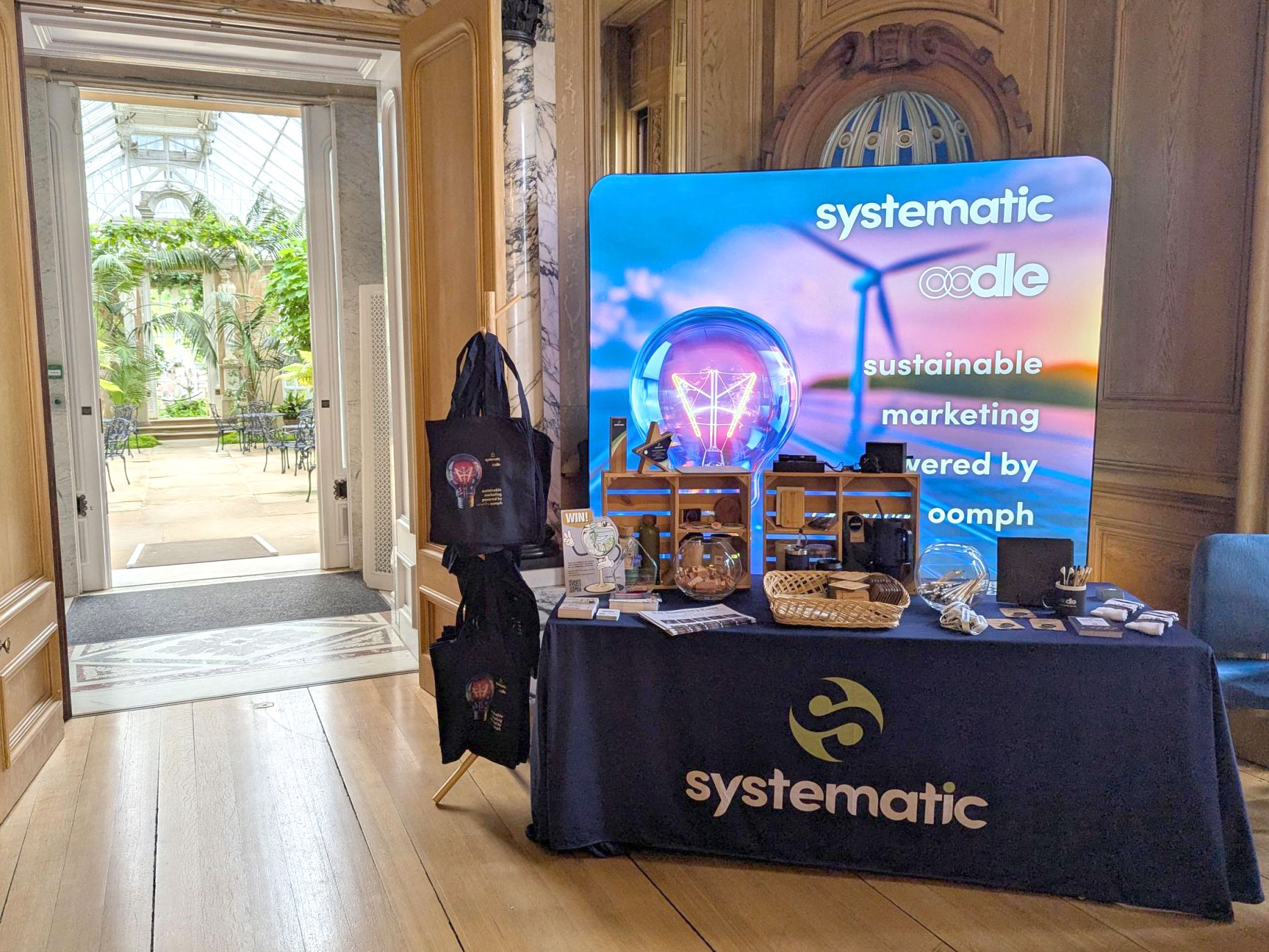
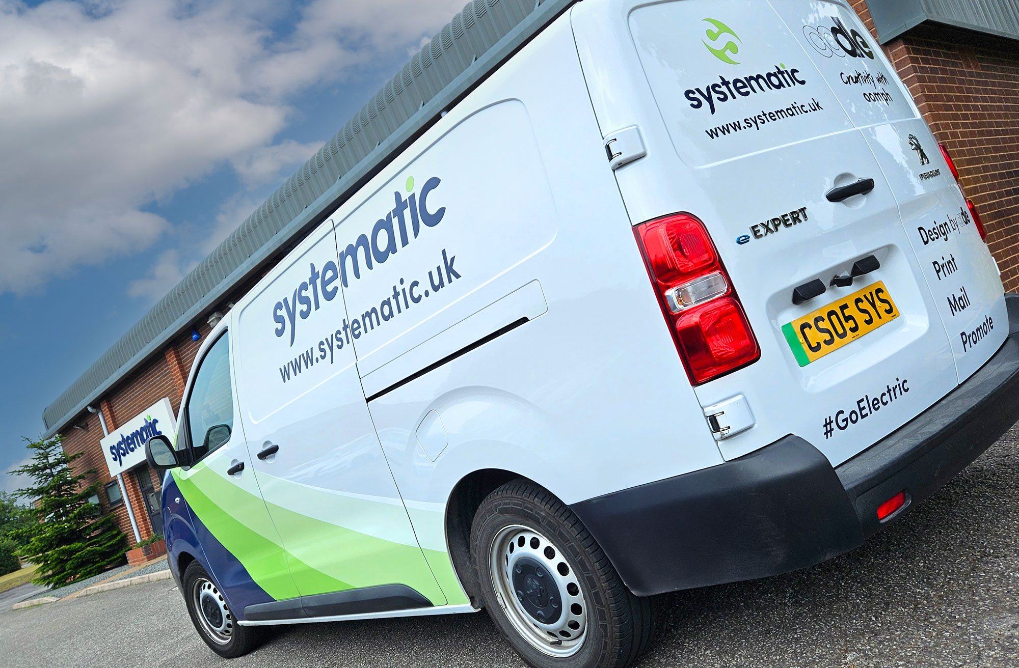
At exhibitions and networking events, Systematic always shows up in style. We’ve produced designs for pop-up banners, lightboxes, curved displays, branded gifts, screen animations, and handouts. And out on the road, we developed electric vehicle livery designs for their growing sustainable fleet, covering both vans and cars.
To mark Systematic’s 50th year, we evolved the brand visuals with care. Keeping the established blue for consistency, we replaced the original green with a more refined gold. The ‘S’ icon was refreshed with a subtle nod to the milestone, featuring a discreet ’50’ in the design.
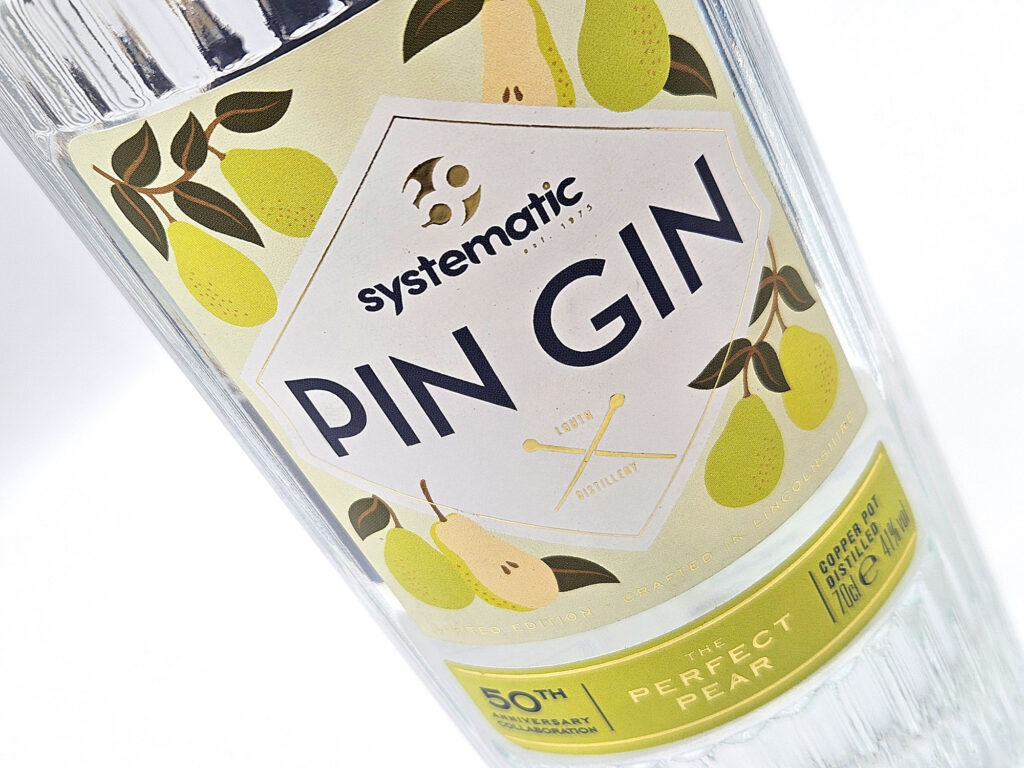
And what’s a celebration without a drink? We created the label for a limited edition bottle of Systematic Gin, developed with Pin Gin and Louth Distillery. The label design borrowed from the Pin Gin style but was elevated with gold foil detailing in line with the 50th anniversary branding, making it feel special and distinct.
Together, these projects show how strong branding and standout design can work hand in hand across print, digital and physical spaces. It’s a creative partnership we’re proud to be part of.